Introduction
The Office of Capital Projects is committed to transparency and to providing easy access to the most current resources needed to successfully deliver and sustain the capital programs and assets of UT System institutions. OCP's Senior Project Controls Analyst develops and maintains the dashboards below to assist all stakeholders in the planning and assessment of our capital resources. Each dashboard can be accessed by clicking on the links or the pictures below.
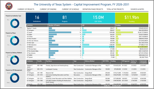
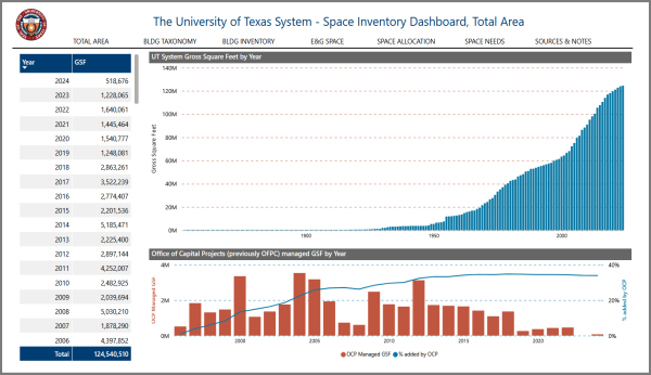
The Capital Improvement Program DashboardThere are five visualization pages on this report. The report includes information on current CIP projects, CIP funding sources, CIP project schedules, projects in the definition phase (pre-CIP), all active projects (both pre-CIP and CIP projects), and the data sources used. | UT System Space Inventory DashboardThere are six visualization pages on this report. The report includes information on total systemwide area by year, buildings by taxonomy, space by institution, systemwide E&G space, space allocation by THECB category, actual space vs. projected space needs, and the data sources used. | |
 |  | |
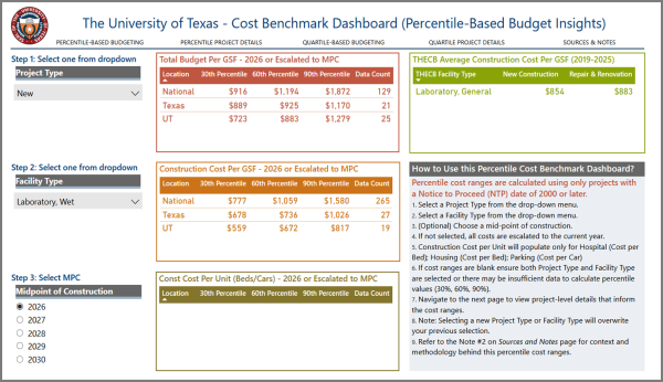
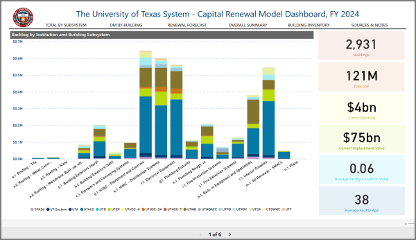
Construction Cost Benchmarks DashboardThere are three visualization pages on this report. The report includes instructions on selecting project types with summary results, the details of the projects selected, a statistical summary of project cost per gross square feet for the selected project types, and the data sources used. | Capital Renewal Model DashboardThere are five visualization pages on this report. The report includes information on systemwide deferred maintenance for next decade, deferred maintenance by building & subsystem, renewal forecasts by facility condition index, an overall summary, building inventories by institution, and the data sources used. | |
 |  | |
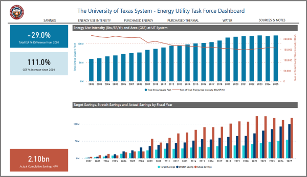
Energy Utility Task Force DashboardThere are five visualization pages on this report. The report includes historical information on energy savings, energy use intensity, energy & water usage at academic & health institutions, and the data sources used. | ||
 |