The University of Texas System is an influential leader in higher education and research. As its ambassadors, our role is to communicate to external audiences in a professional and consistent manner across all communication points. These visual guidelines exist to help in crafting communications that are sophisticated and representative of the UT System Administration. Please use this styleguide as a reference during all aspects of the design and production of your communications efforts.
The UT System visual identity is much more than a seal or wordmark.
The UT System's visual system serves as a graphic identifier for the UT System Administration. The entire visual identity system is comprised of several elements that include: Seal/Wordmark, Illustrations, Photography, Typography, Color Palette, Templates and any other element used to visually communicate our messaging. Strategically and consistently applying the UT System's logo, layout themes, colors, etc., across many types of media is an important part of the branding process and helps to reinforce the UT System brand through visual identity.
On this page:
UT System Seal
The official identity of the UT System is the UT System Lockup, which consists of the UT System seal and wordmark — the tagline has been removed and should not be used. Lockups exist in both vertical and horizontal layouts and in a variety of color combinations in order to assist in layouts, print requirements and sizing limitations. Do not create any additional taglines, add icons or artwork and do not alter the seal in any way. If you have questions regarding usage and modifications, please contact branding@utsystem.edu.

Files for Download
Employees and staff from all UT System institutions can download the UT System logo files, PowerPoint templates and digital letterhead from our Branding Sharepoint page below.
*Please note, a SNAC login and password are required to access the page.

Typography
Consistent use of the following typefaces promotes a unified and professional appearance across all official communications.
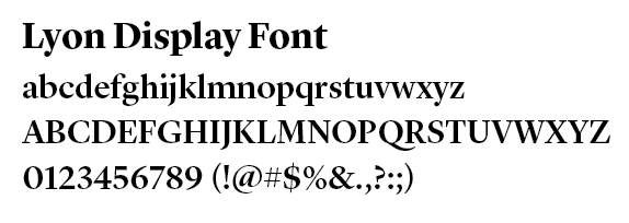
Lyon Display and Mrs. Eaves are the recommended primary typeface for UT System communications pieces. Lyon Display is used in our logotype lockup, and helps promote an approachable, stoic and elegant voice. It is not necessary to use Lyon Display or Mrs. Eaves for general correspondence.

Licenses for Lyon are available for purchase at: https://commercialtype.com/catalog/lyon_display
Licenses for Mrs. Eaves are available for purchase at: emigre.com/OT/Mrs-Eaves.
Bentham (from Google Fonts) is an acceptable alternatives to Mrs Eaves.
----
Gotham, our secondary typeface, is suited for working with dense sets of data, like metrics, financial reports, asides, catalogs and confined areas of space.
Gotham is available for purchase at: typography.com/fonts/gotham/styles.
Montserrat (also from Google fonts) is an acceptable alternative to Gotham.
Colors
Every UT System institution incorporates orange in some way to align itself with the UT System. Orange is a unifying brand element across the System. UT System Administration is no different. Color is a critical institutional identifier. When creating communications be sure to adopt our official palette of color.
UT System Navy Blue
Spot: Pantone 540 (uncoated and coated)
CMYK: 100, 55, 0, 55
RGB: 0, 55, 103
Hex: #003767
UT System Orange
Spot: Pantone 158 (uncoated and coated)
CMYK: 0, 60, 95, 0
RGB: 244, 122, 32
Hex: #F47920
Accessible Orange
Hex: #ca4b0c
RGB: 202, 75, 12
Color Contrast and Accessibility
Text and background colors that have too little contrast between each other can cause readability issues for users who are color blind or have low vision. Insufficient color contrast is a common violation of state-mandated web accessibility requirements.
UT System Orange does not provide sufficient contrast with white (or other light colors). It should not be used as text color over a white/light background or as a background for white/light text in a web context. Accessible Orange is an acceptable alternative intended for minimal use.
Supporting Assets (PowerPoints, Email Signatures)
Clear and consistent email identification strengthens the UT System brand. It is best to use the full email signature whenever representing yourself as part of the UT System, especially since many of your messages go to individuals and organization outside of the System. Please see the email signature sample below for reference and a list of items to consider avoiding. If you have any questions please contact branding@utsystem.edu for further assistance.
Items to consider avoiding in your email signature:
- Email Address (We recommend not including email addresses in signature blocks. The email address is already visible in the memo heading of the message and its use is thus redundant.)
- Inspirational quotes or philosophical statements
- Links to personal media accounts
- Graphics, other than the optional University of Texas System seal.
- If the seal is not used, be sure to spell out The University of Texas System
- Images may not display properly in all email programs, and a distorted image diminishes the UT System brand. Often, images are treated as attachments in the recipient’s inbox and can clog the user's inbox or cause email to be filtered as spam.
- Using colors other than those belonging to the UT System brand guidelines. Do not select orange or blue from the basic color menu.
Email Template
You can find the email template on our Branding Sharepoint site. Under the Branding files list, you can download the email signature file, open it in Outlook and copy paste the information into your signature file.
If you are interested in using an email disclaimer, please contact Cristina Blanton, Systemwide Privacy Officer, at cblanton@utsystem.edu or 512-852-3264.
PowerPoint Templates
Template files can be found on the Board Meeting PowerPoint Templates page.


